the logic of contrasts

I have read, listened, written, drawn, painted, photographed, visited Everything can be more interesting if you remain curious, if you do not lose the desire to learn and experiment. I pause to observe the contrasts of colors, the different points of view of a shot, the sound of synonyms with which the same thing can be described, the harmony of a painting. A note can also be color, poetry is also melody, an image can scream more than one word. The expression: that's all... it's all here. (Editorial Director - Art Director)
To talk about myself I would use the English concept of Language Enthusiast, with its bad translation into Italian. Years of study, travel and authentic and pulsating passion for what lies beyond the border converge in this expression. I have an indiscriminate interest in any culture and any person with a story to tell. I remain with difficulty compressed in my dimension, I feel the continuous need to push myself further. I can't stand the innuendo, the half sentences and the boredom of waiting rooms. Certainly communicative, analytical, I split reality into a thousand pieces and then reassemble it. I think and write in 4 languages, which I love all of them, because inside they sing me a beautiful song. (Editor - Translator).
What unites Piacentini's Architecture with Greenaway's Cinema, Munari's Design with Tiepolo's painting and Kandiskij's studies? What unites the election posters with the paper tickets we used for the tram? For visual culture, the challenge of the third millennium lies in seeing the red thread that binds each of its branches to tell the image and aesthetics. I would like to do it through a passion that comes from the tradition of classic cinema. After all, what is the history of Design if not the cerebral attempt to give a soul to matter, to plagiarize the form according to its most hidden meaning and all to be revealed? (Editor - Reporter)
 657
657
 10
10
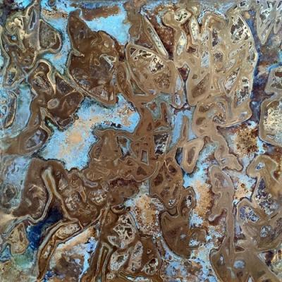
Often the "logic" that we use in the West, the Greek one then revisited in other forms, is structured on the dialectic of "opposites", citing a concept and its opposite. Light and darkness, day and night, light and dark, order and disorder and so on. And visually? Even our culture linked to images can exploit this dichotomy to create its own harmony, a pattern, something that generates scenographic virtuosity. Clearly if in thought this way of arguing often gives a moral sense to speech, with shapes and colors it is instead an opportunity not to send a message, but to showcase diversity by placing them side by side. Let's see it in the example of the metallic textures of PLANIUM to decorate with floors and walls.
In the brand, the variety of brass, copper and various types of steel give life to different collections: Charme, Silver and Eclipse. The Metal-Morphosis collection features designer oxidized slabs starting from natural metals. All thanks to controlled oxidative processes that generate surprising colors and create artistic surfaces and unique coatings. With these oxidations, combinations of this type become realistic for furnishing interiors with metal, with a smooth texture in its metallic "integrity" alongside an oxidized metal texture that represents an explosion of colors.

The Chromatic Contrast between Natural and Oxidized Copper
Thus it will be possible to alternate, for example, coppery, an essentially warm color, an oxidation of copper which, while retaining its base, opens up to decidedly more expansive tones and horizontally to bluish colors and linked to shades of blue, representing settings similar to the seabed, but also to cartographies, as close as it is to the land-water union. The "smooth" Copper, therefore, in its basic textures, allows with the juxtaposition of the oxidized Copper a chromatic range that can lead to a double direction and to a scenography that covers at least two different directions, and all starting from the same material. The "red" (or "red/orange") base is accompanied by a riot of colors with unpredictable shades that break up the monochrome and constitute an alternation that will be able to mark the interiors of 2023.